Download Fine Food Font Family From Jeff Levine
 |
A 1942 photograph showing the exterior of the famous Hollywood restaurant Sardi’s and it’s unusually lettered sign was the inspiration for Fine Food JNL.
Classically Art Deco, the Sardi’s sign had an ‘S’ looking like an inverted ‘J’ with a flat tail, a traditional ‘A’ replaced by a triangle and the ‘R’ composed of a ‘D’ with a diagonal extension.
These elements were balanced against more traditional [but complementary] characters to retain the novel charm of the original signage.
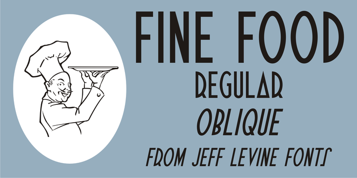
Fine Food JNL is available in both regular and oblique versions.